Zara
Website Redesign
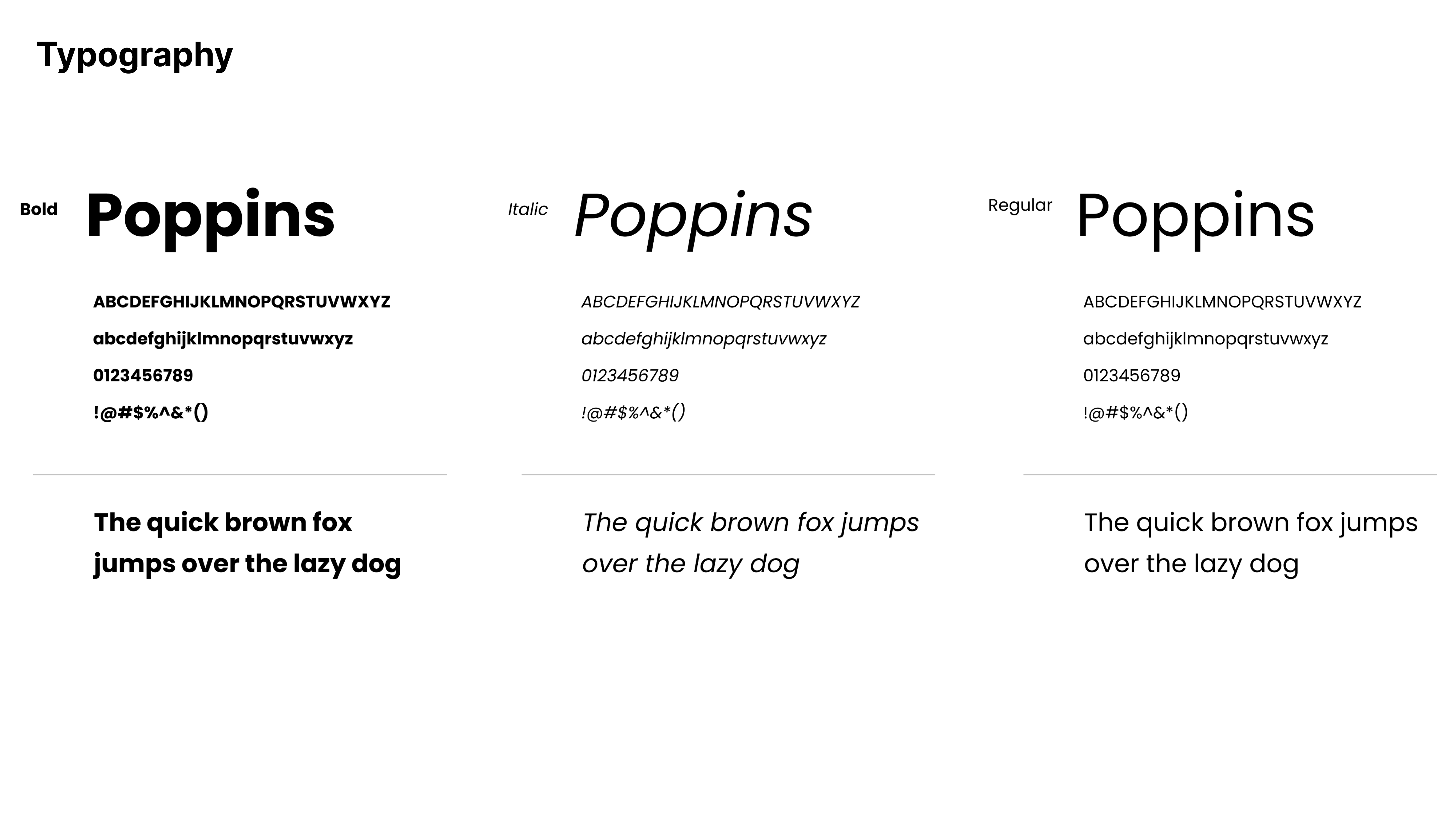
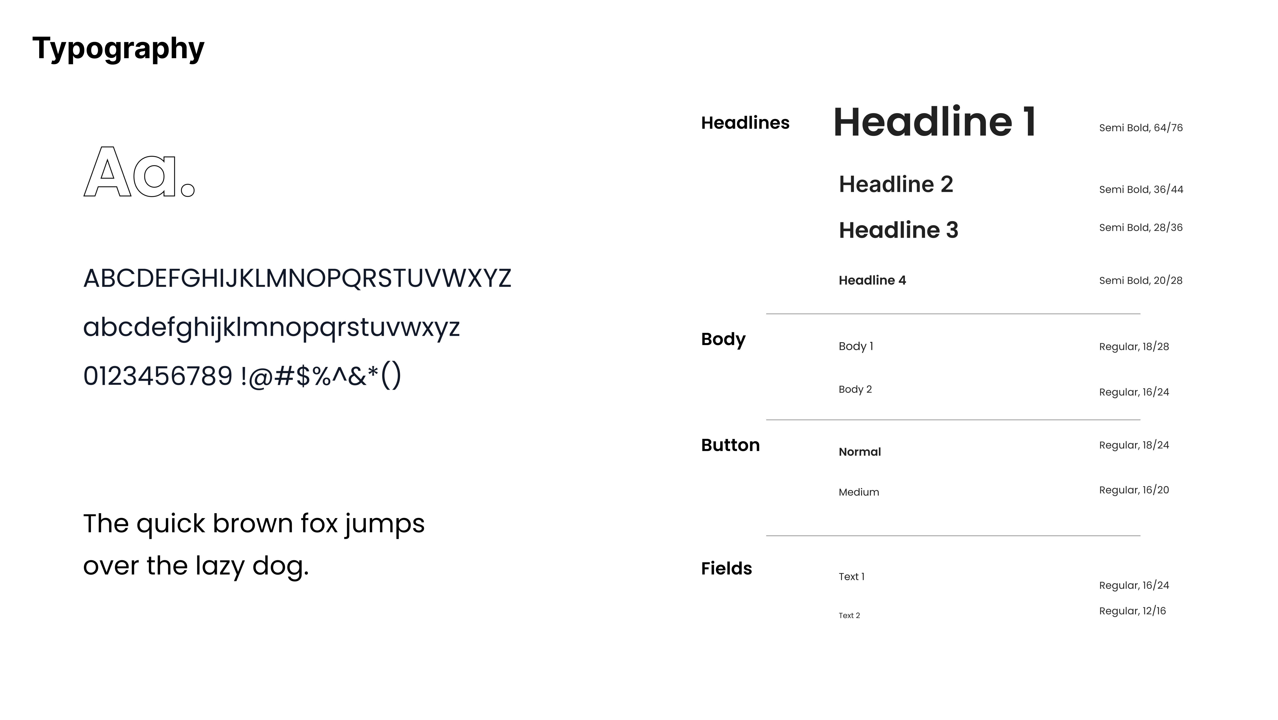
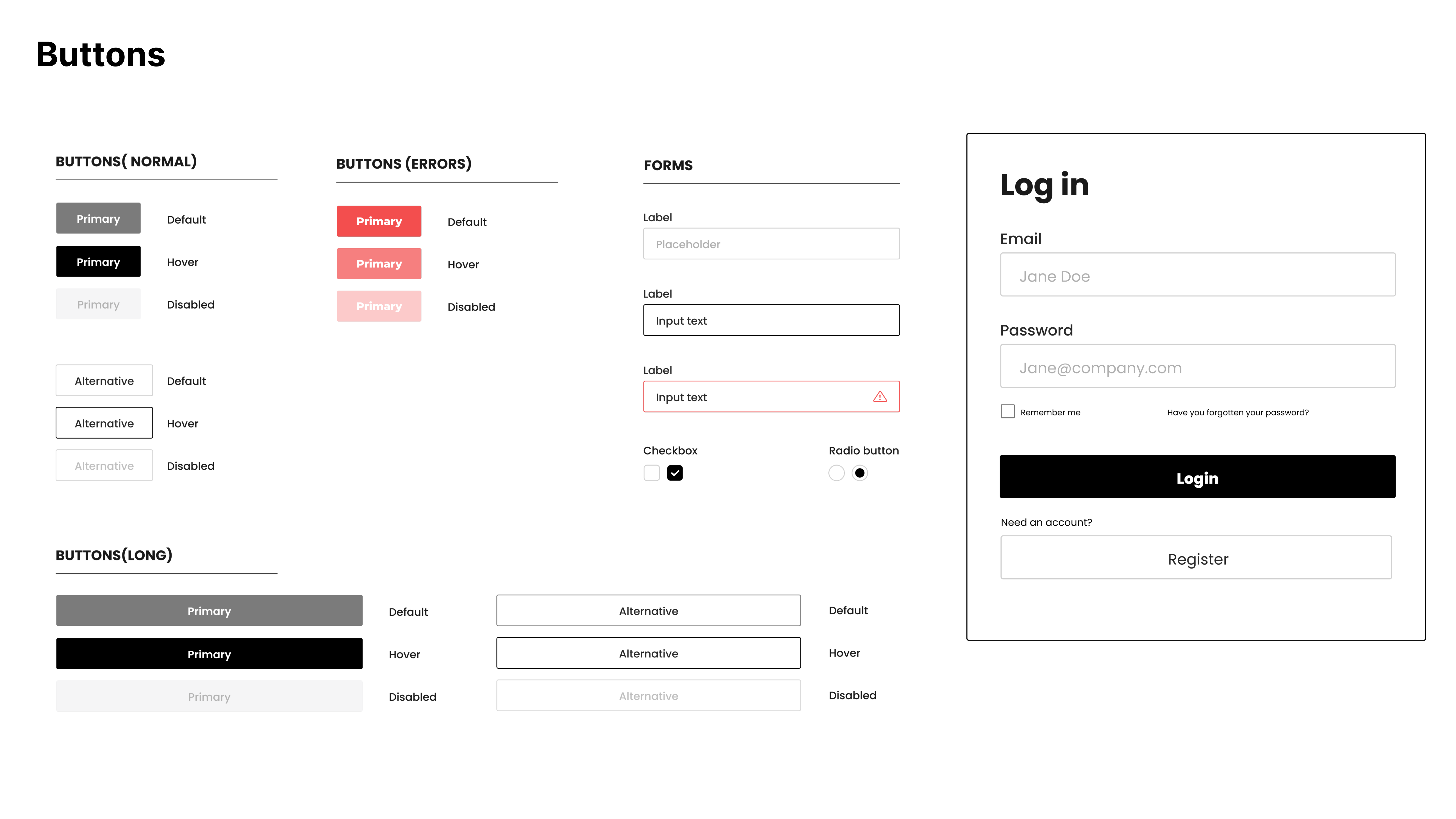
Zara’s website was visually attractive, but shopping itself (which is the goal of site visitors) proved to be difficult. I worked on the benchmark, user personas, empathy map, user tasks, task analysis, competitors overview on each task, information architecture, wireframes, design system and finally the redesign.
@3x.png)
Year
SEP 2023 - JAN 2024 (4 months)
Modality
Group (5 people in total).
My role
Group leader
Context
Course “Ergonomics Applied To The Design Of Usable Web Pages And Apps” from the MSc in Integrated Product Design
Tools leveraged


Companies Involved

Venturing into the Unknown
Zara is a globally renowned fashion retail company known for its trendy and affordable clothing and accessories. Founded in 1974 in Spain, Zara has become one of the world's largest and most recognized fashion retailers.
Operates in 90+ markets with a global e-commerce platform
Offers thousands of products across multiple categories
6.5 billion online visits reported by its parent company Inditex (2023)
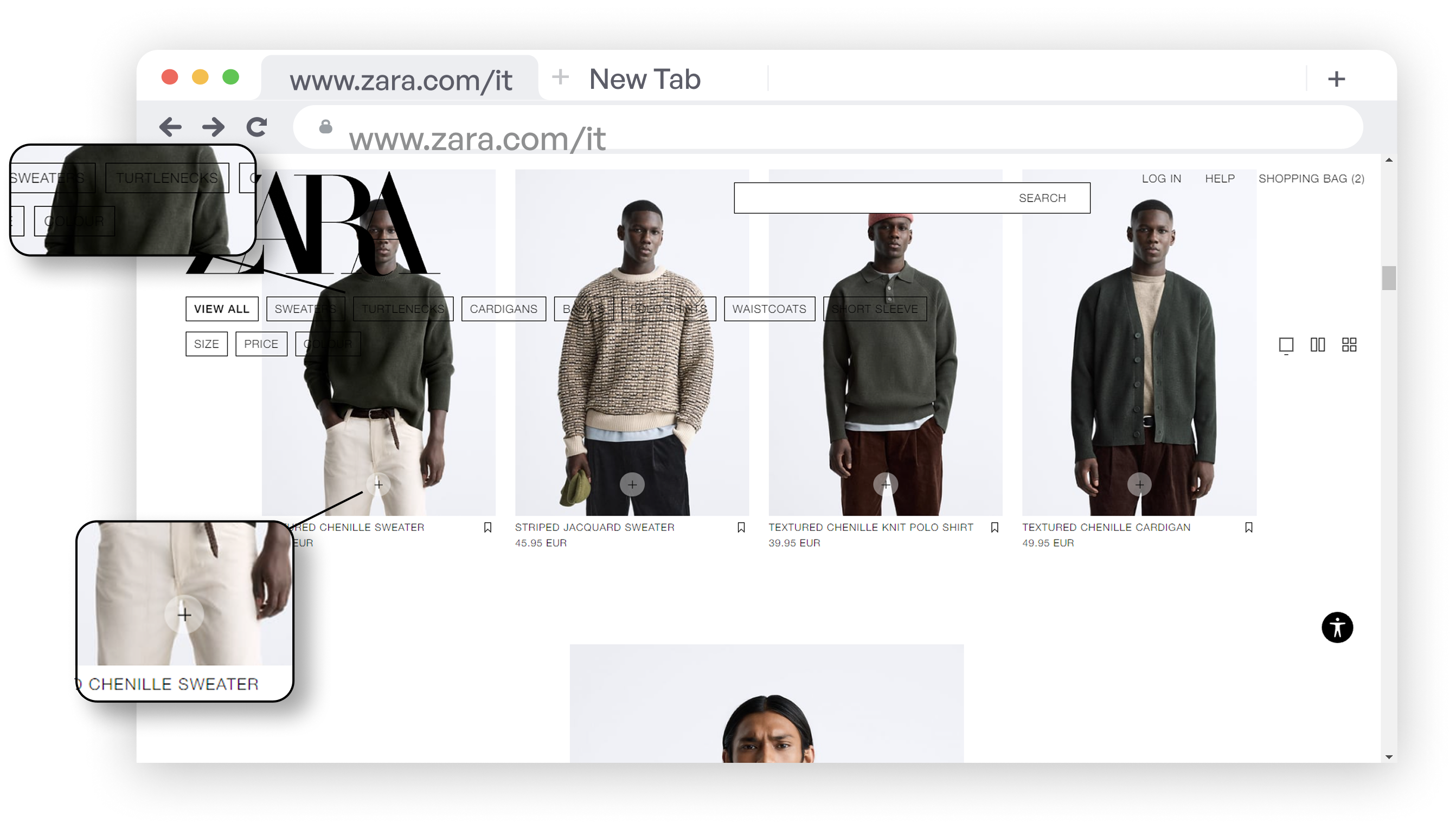
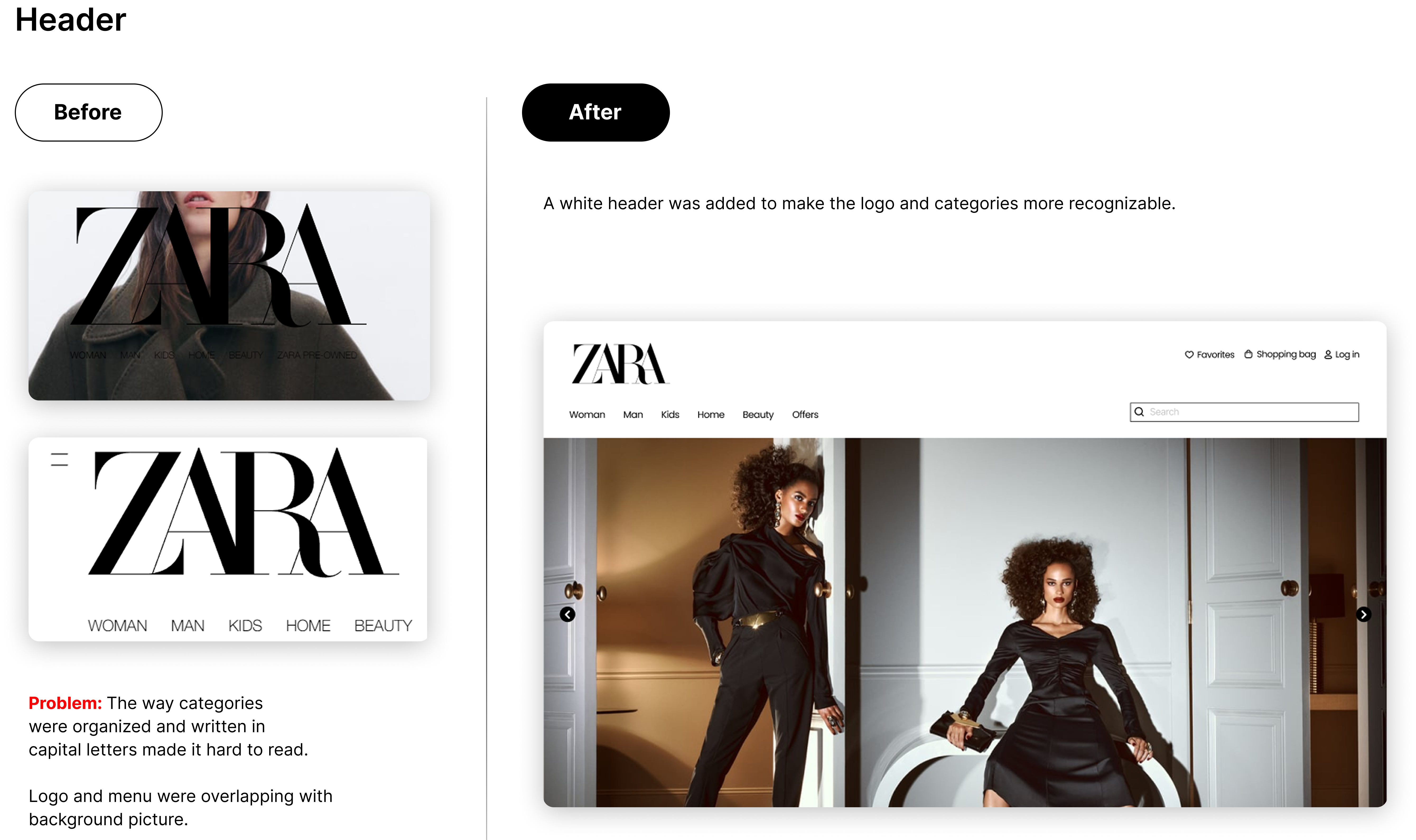
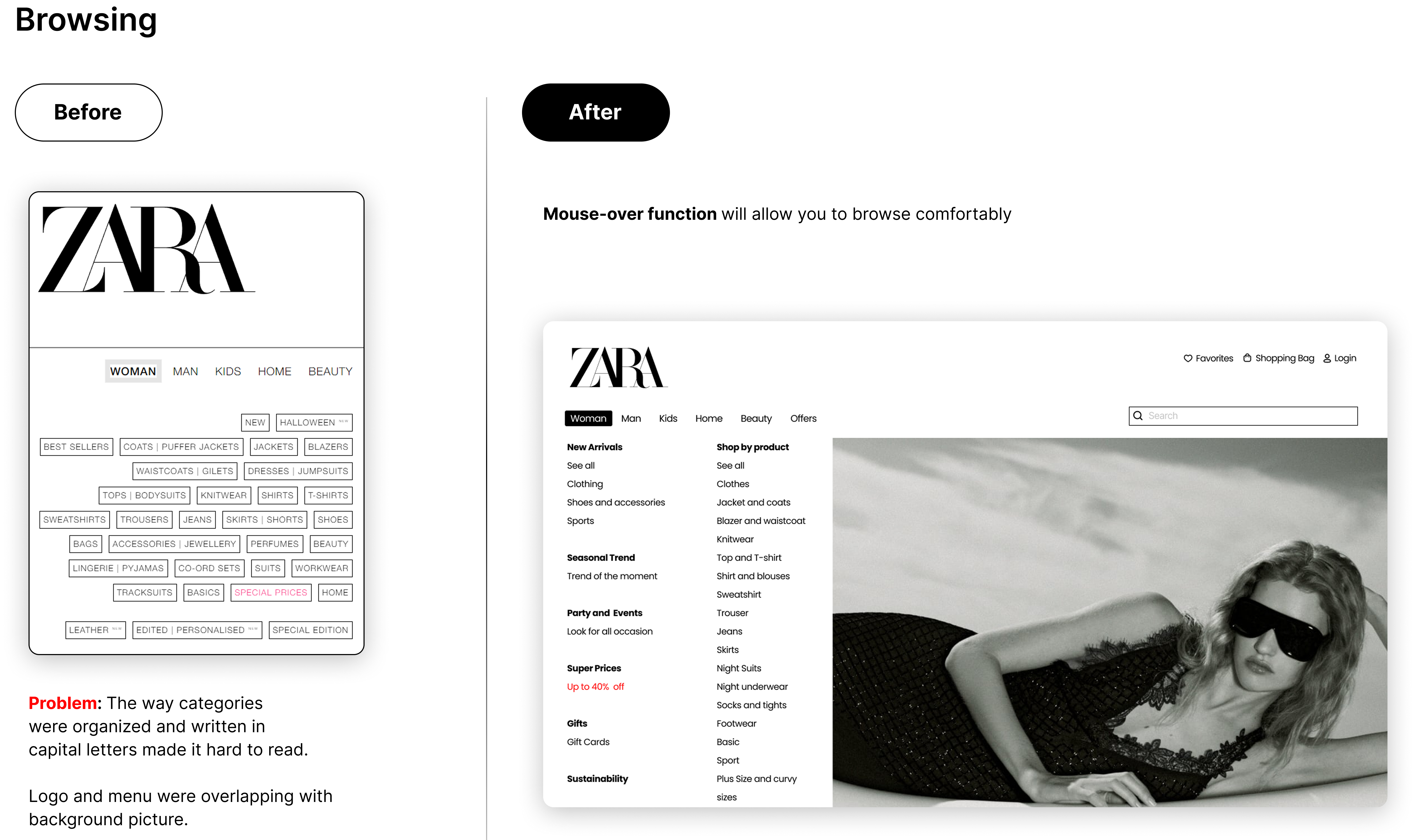
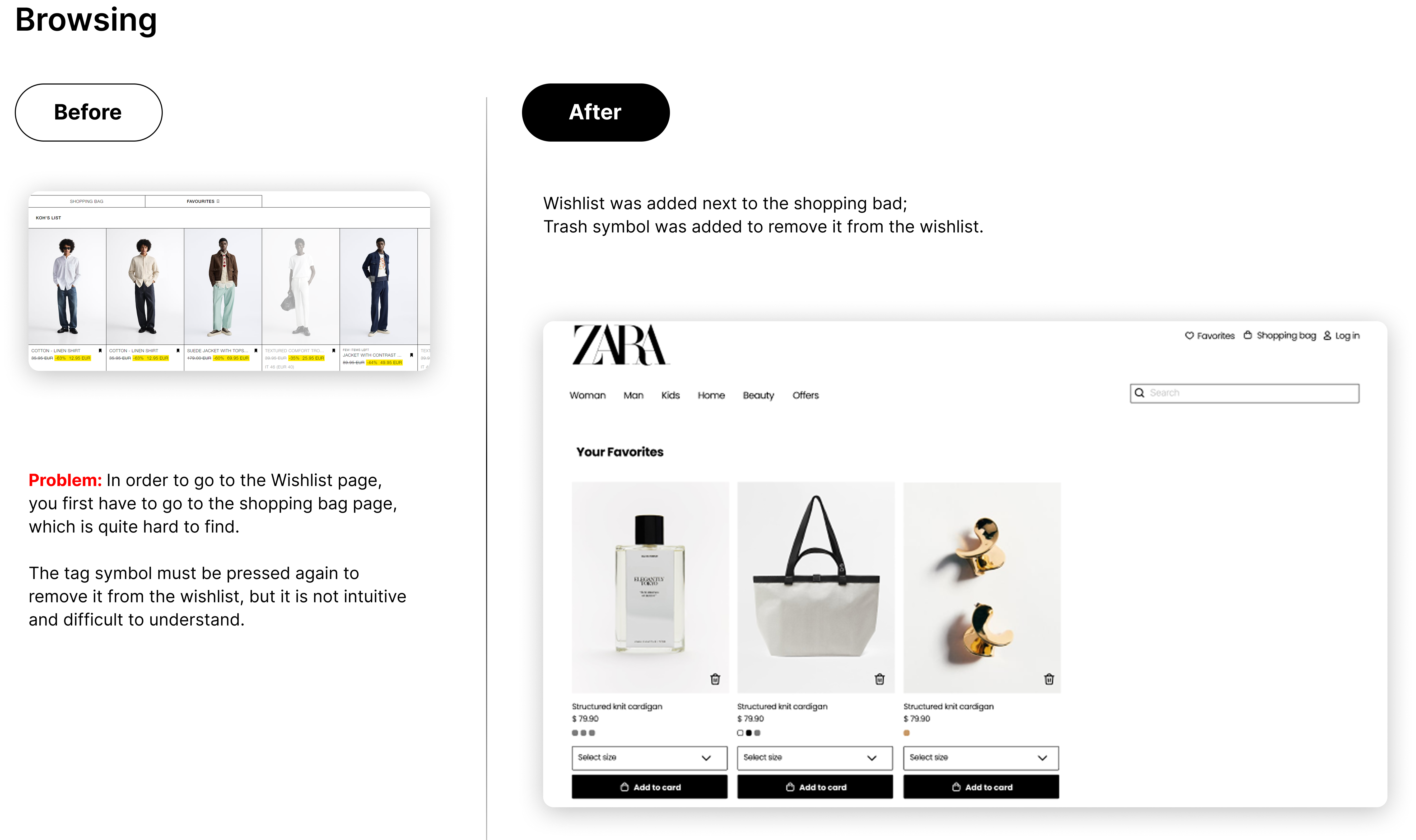
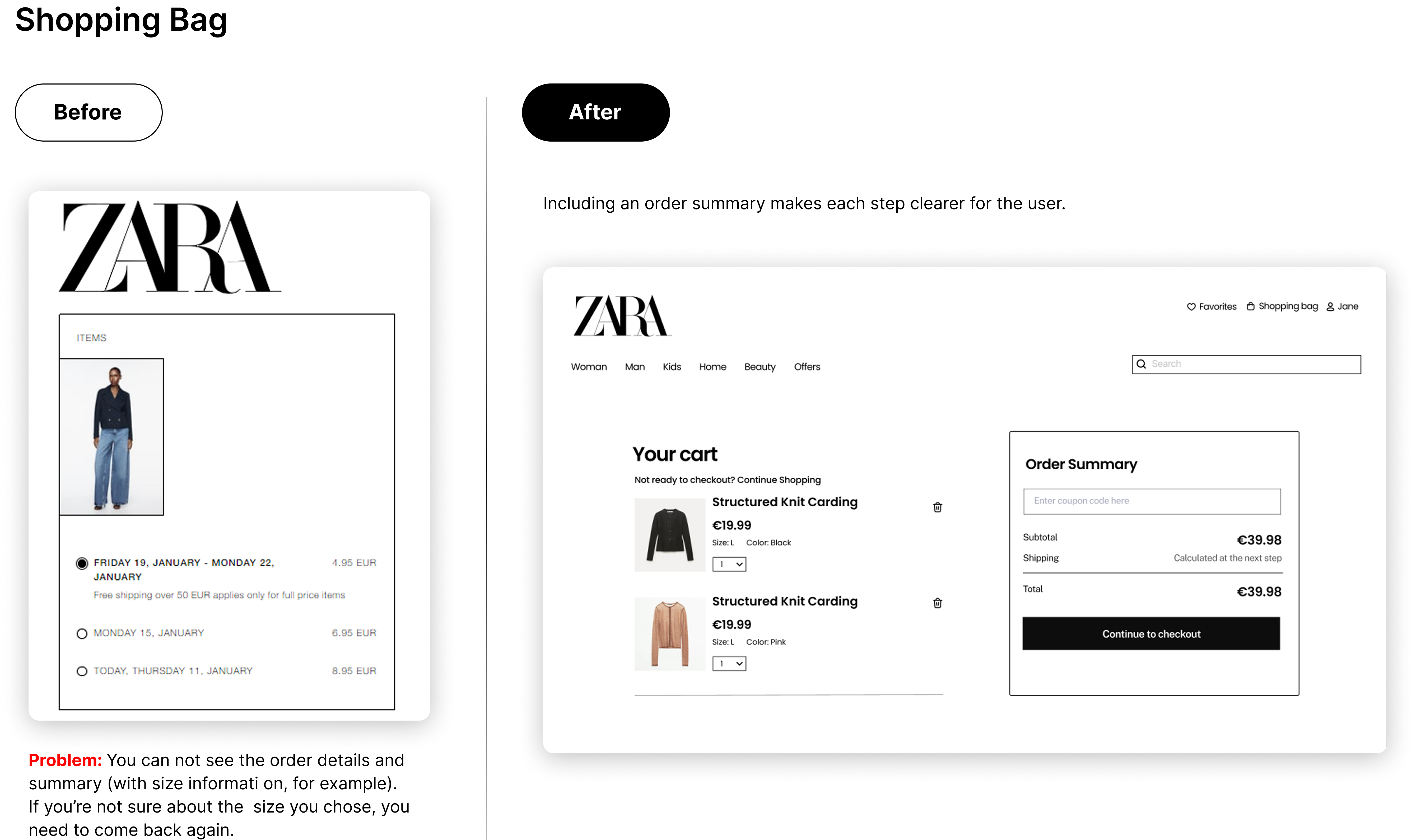
Navigating Zara’s website felt more like wandering without a map than an effortless shopping experience. Key content was hidden behind a hamburger menu, the information hierarchy was unclear, and users had to work harder than necessary to find what they needed.
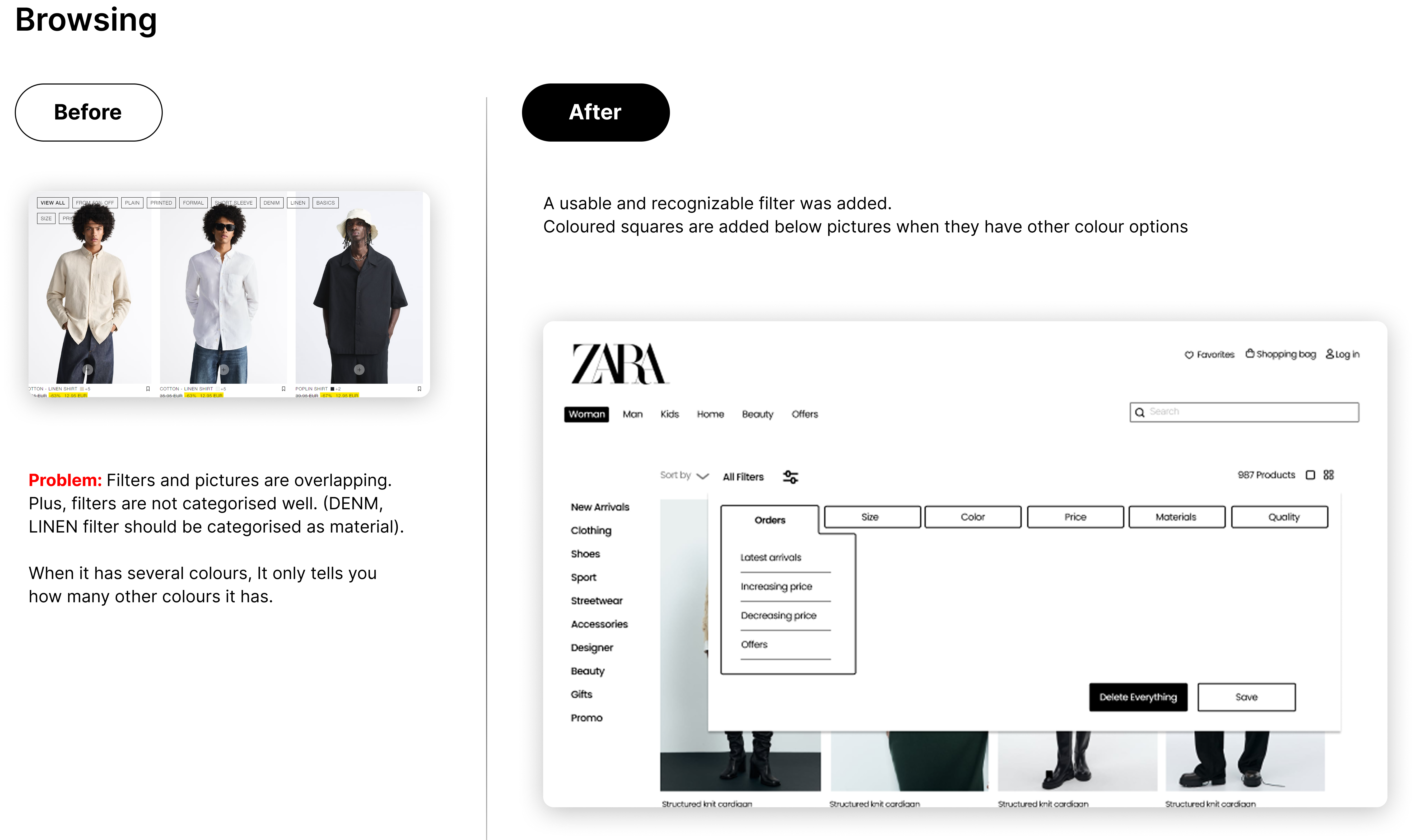
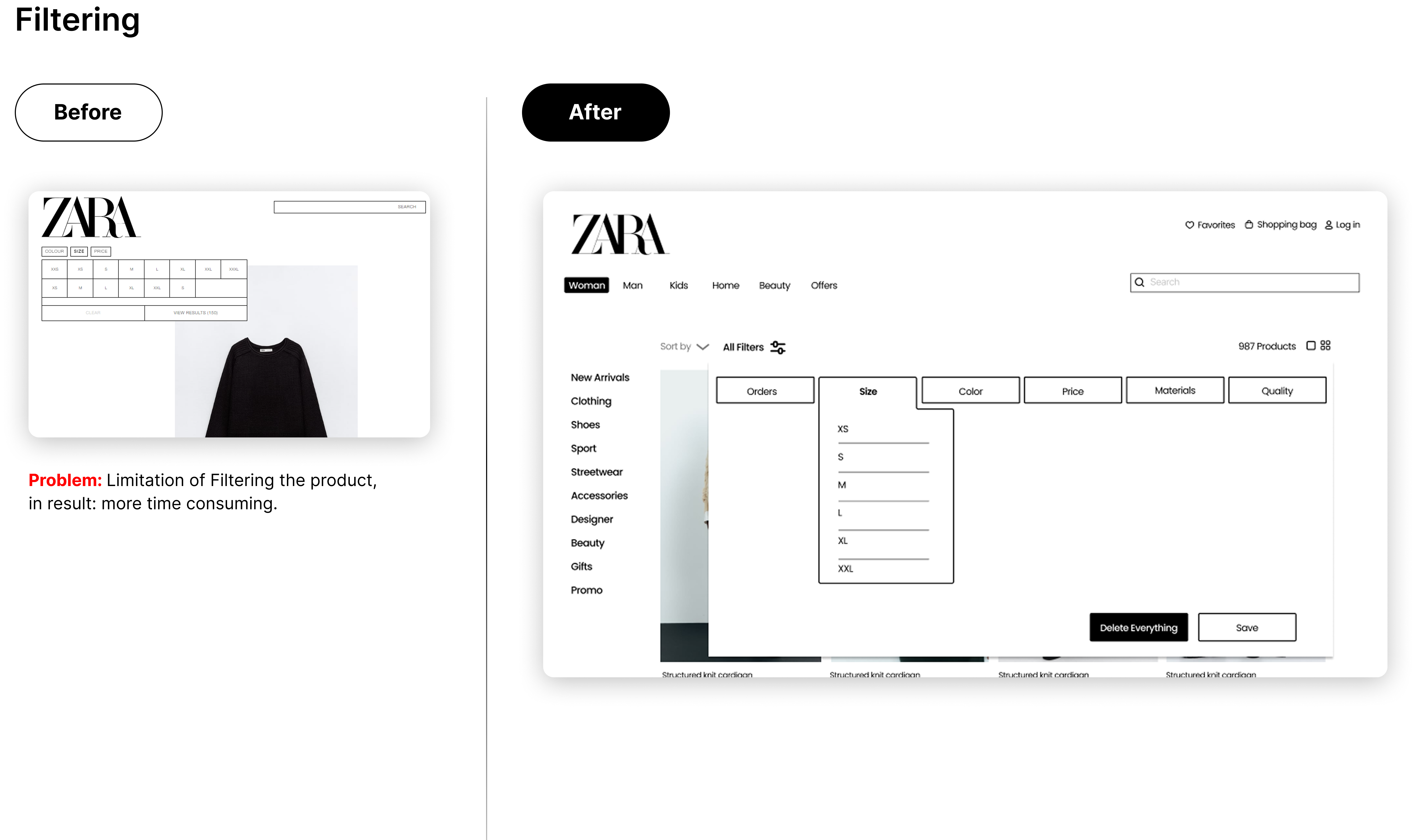
Filtering products was equally frustrating: limited filters, ambiguous buttons, and missing key details—like available colors—made decision-making slower and less intuitive. Visually, the experience relied heavily on text, with few images and small typography, reducing readability and engagement. Combined with inconsistent layouts, this created a sense of confusion rather than confidence while browsing.
The Adventure Begins
By identifying the three main user tasks (Buy a specific item, Browsing and Find perfect fitting clothes), I simulated each one of them on Zara’s website and its competitors (Mango and Uniqlo). After understanding how many web pages and clicks were needed to complete each task and analysing how smooth and intuitive was the experience, I could come up with a final evaluation.
Cognitive Walkthrough
Overview
Although visually appealing, the homepage presents issues with information hierarchy, alignment, and navigation. The limited use of imagery forces users to rely heavily on text, resulting in a slower and less engaging experience.
28 pages
98 clicks

Cognitive Walkthrough
Overview
The website presents several usability challenges. Limited visual clarity makes icons and key information difficult to locate, leading to slower navigation and a potentially frustrating experience caused by unclear interactions and confusing interface elements.
12 pages
39 clicks

Cognitive Walkthrough
Overview
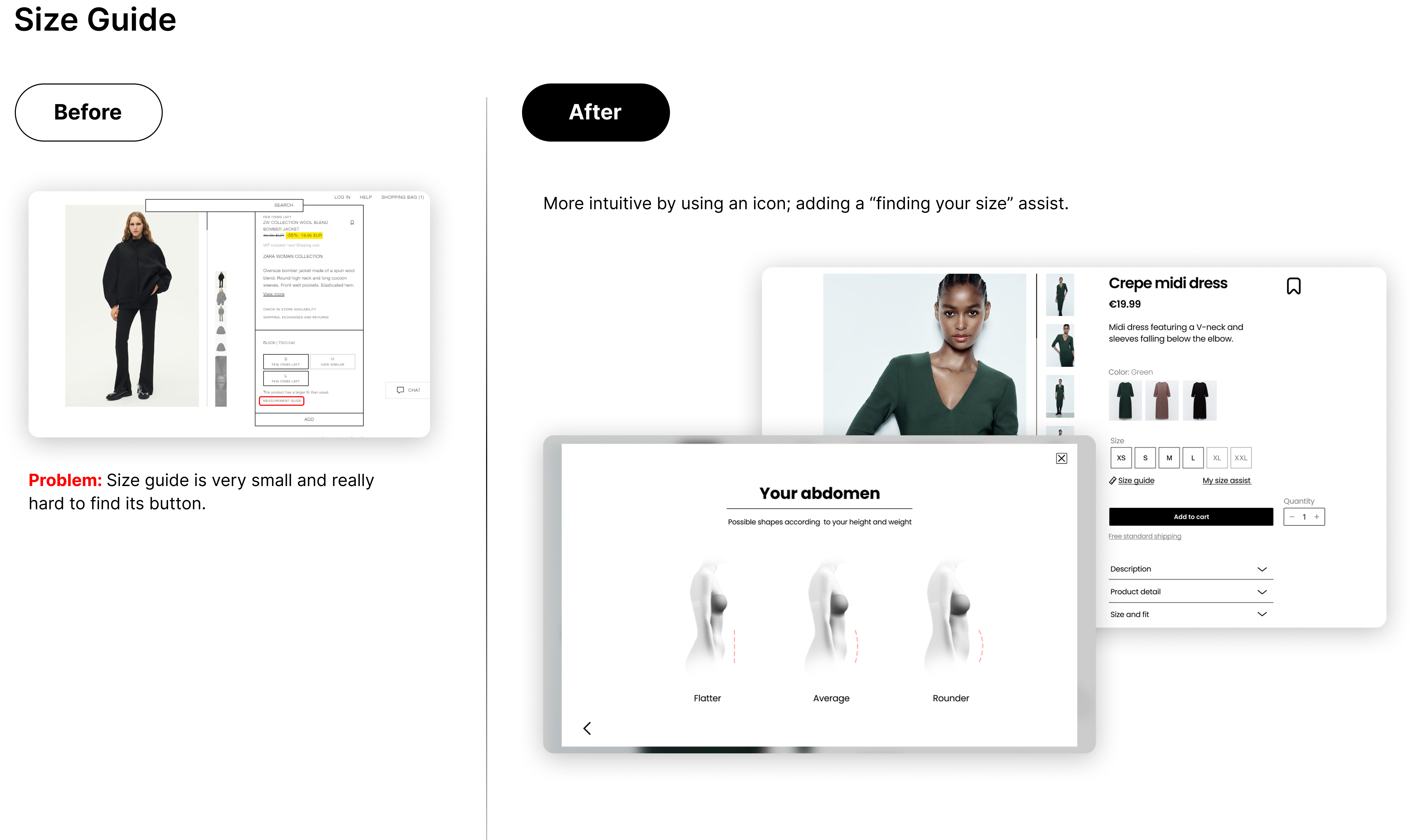
The poor information architecture, consistency and clarity, makes it hard for users to find the right garment sizes. Users often face a frustrating experience with excessive page navigation and clicks due to unclear information and a system that doesn't remember previous selections, leading to a less than ideal 60% satisfaction rate in finding the perfect fit.
9 pages
33 clicks

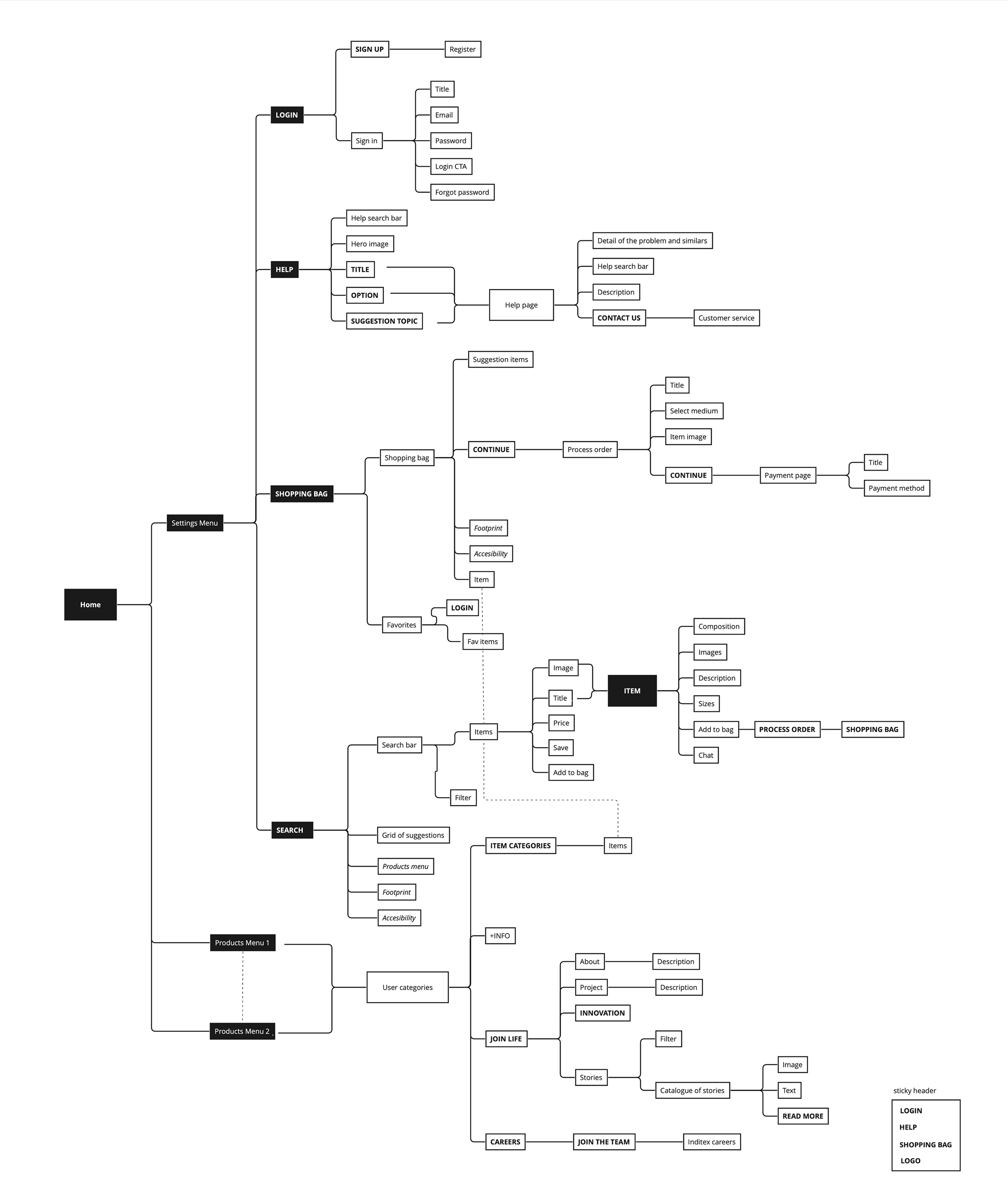
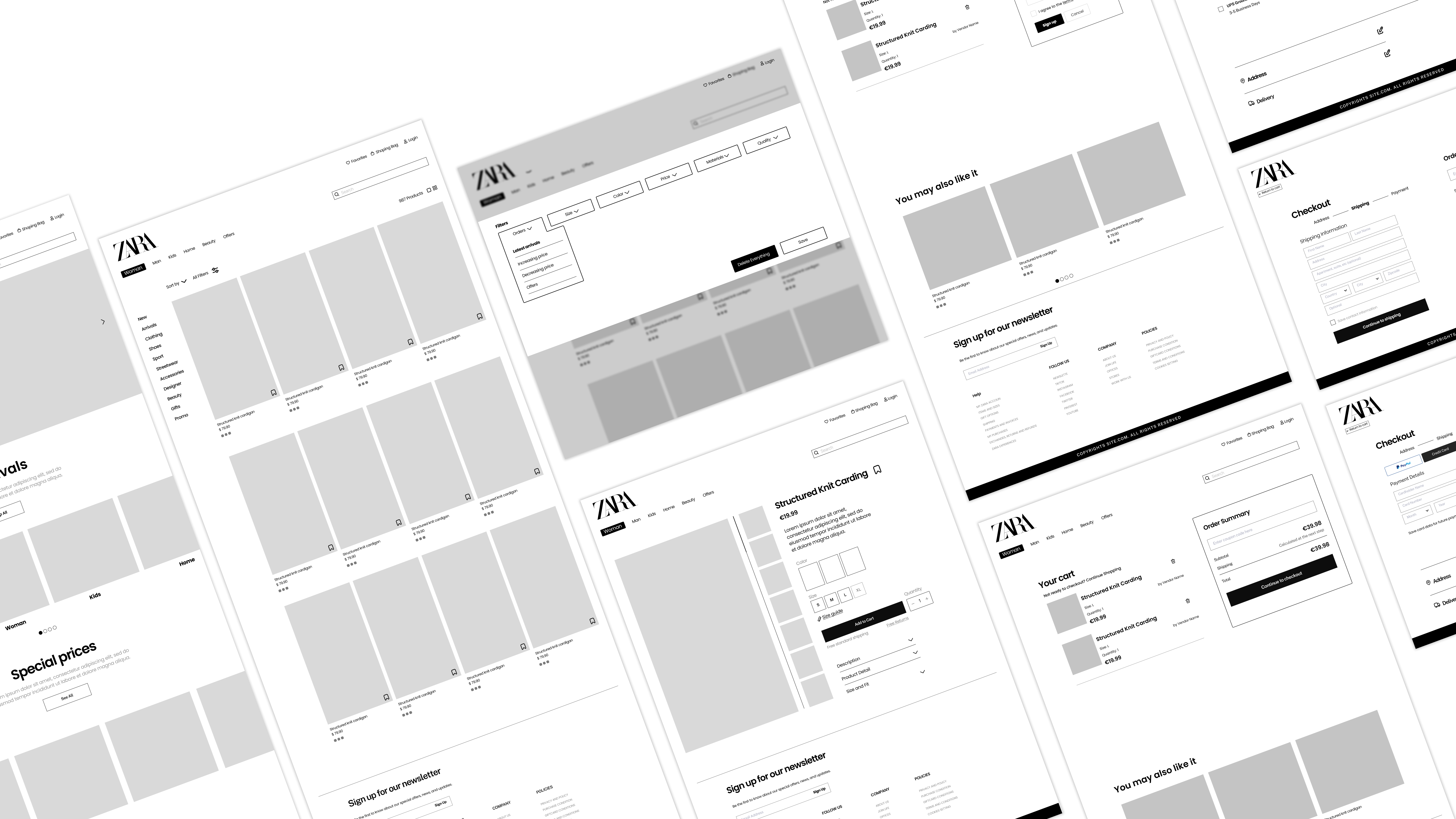
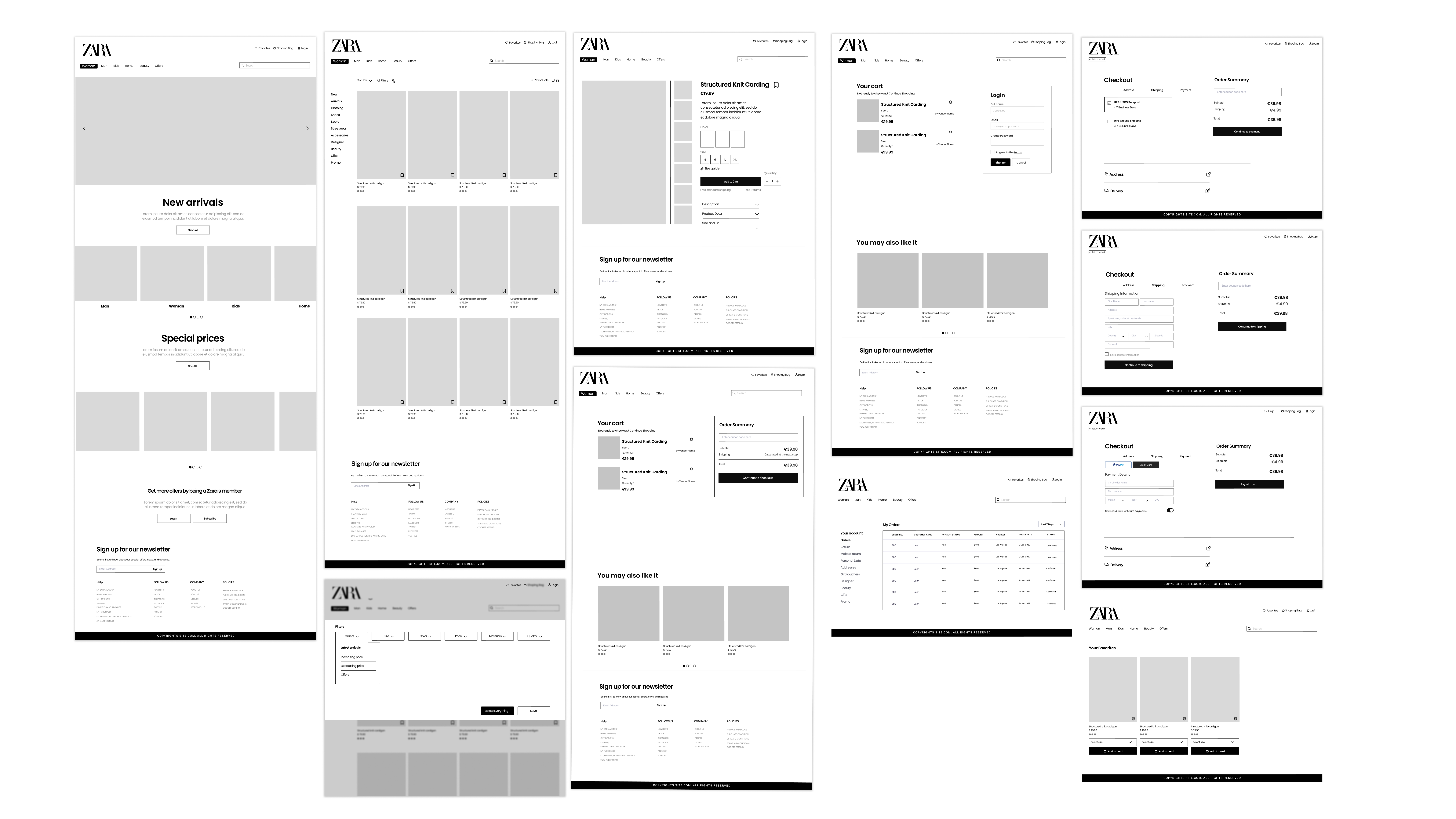
I mapped the website’s general information architecture as well as the three main user tasks and its issues. They became the focus of the redesign, that started with the information architecture of each one of them.

Broader Horizons
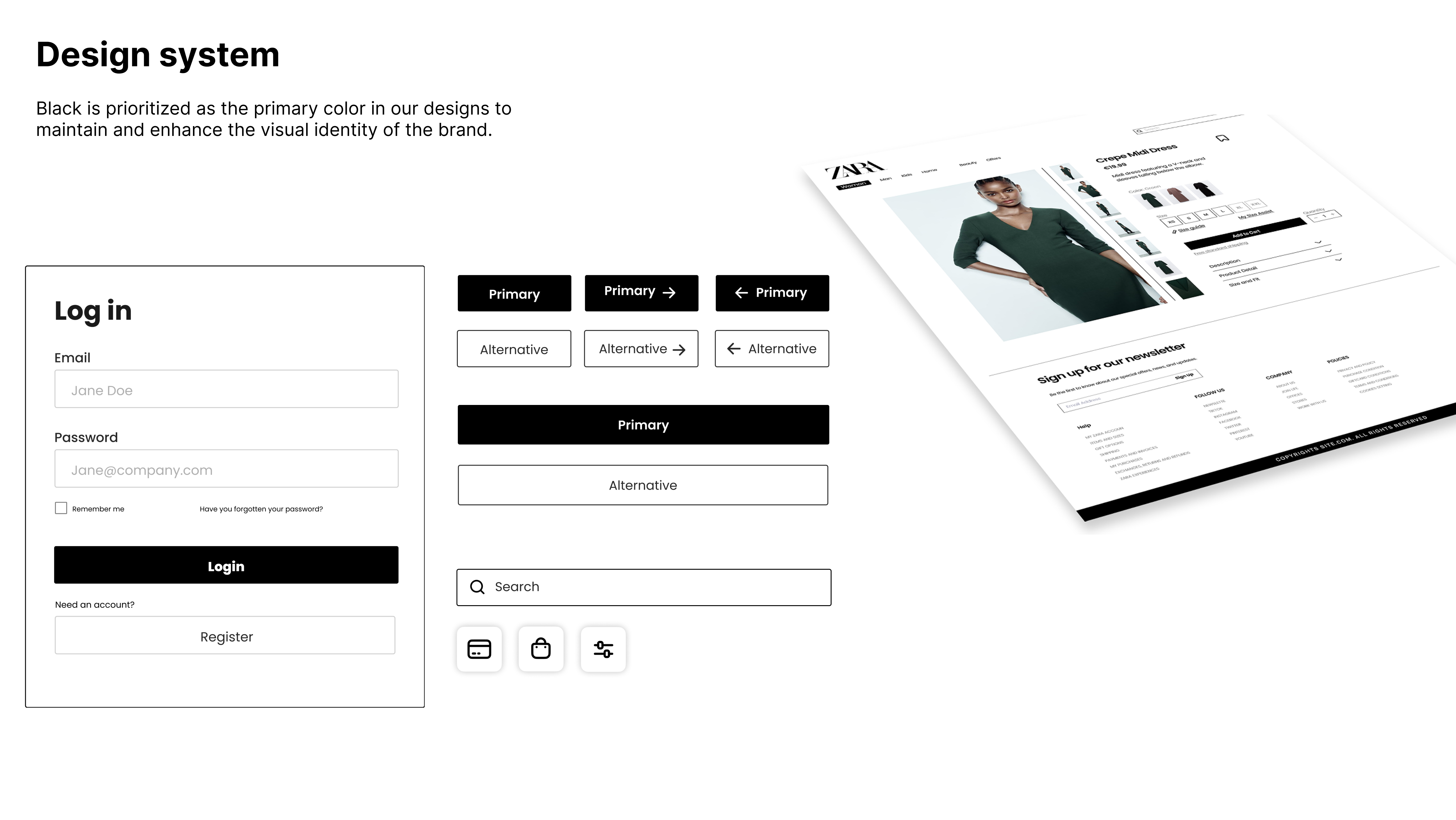
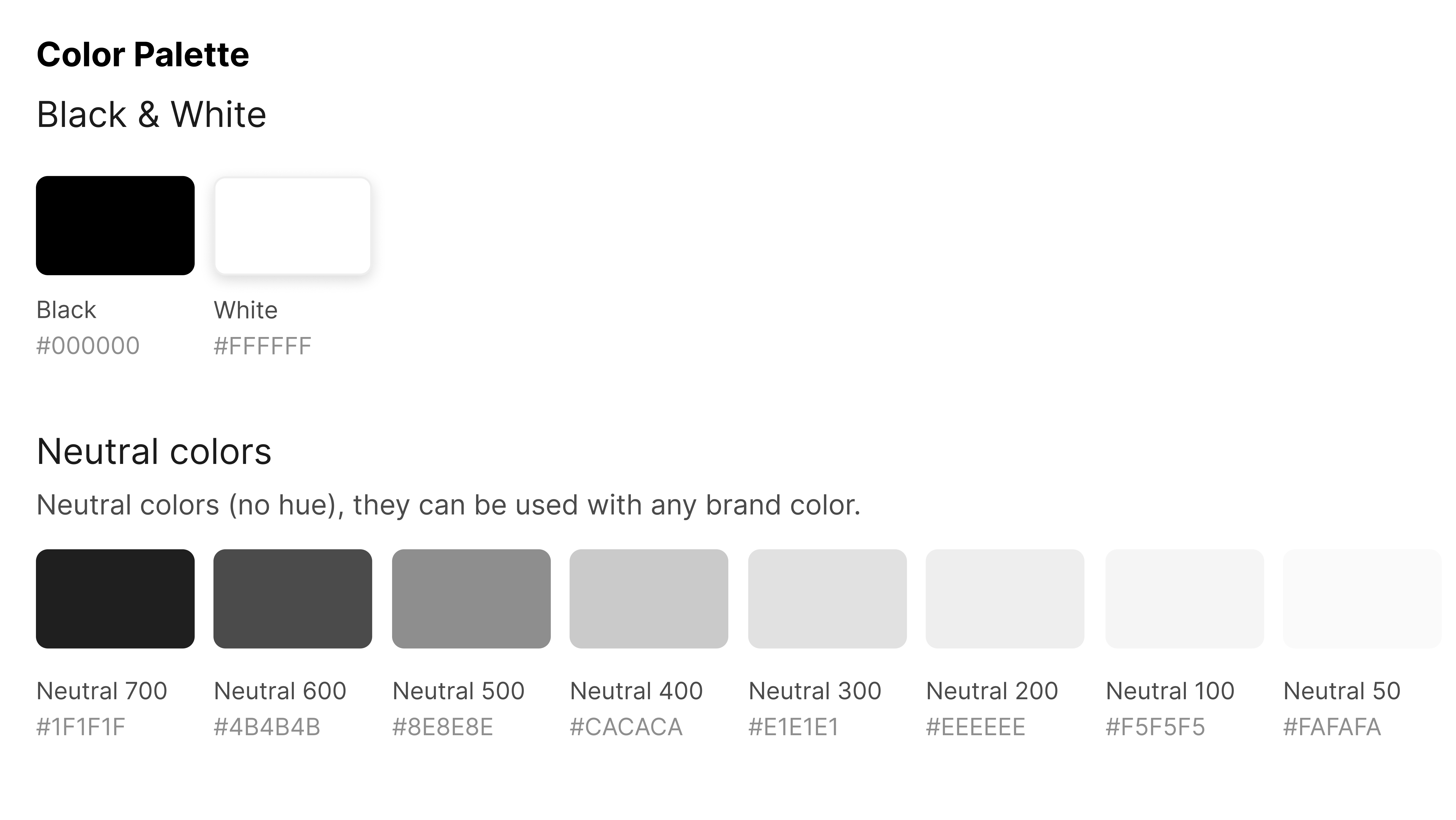
Balancing Brand Minimalism with Usability
Zara’s brand identity is rooted in extreme visual minimalism, which often conflicts with usability principles such as clarity, visibility of system status, and discoverability. Many usability issues were not caused by visual clutter, but by too little guidance for users.
How I solved it
Instead of adding visual noise, I focused on hierarchy, spacing, and interaction cues. Small but intentional changes—such as clearer navigation patterns, improved typographic hierarchy, and more explicit interactive states—allowed usability improvements while fully respecting Zara’s minimalist aesthetic.
Validating assumptions without live user testing
Without the possibility of conducting live user testing, the project required making design decisions based on assumptions rather than direct user validation.
How I solved it
Assumptions were treated as hypotheses. We relied on our experience as e-commerce users, supported by competitive analysis and five user personas representing different Zara customer profiles. These personas helped map user goals and tasks, allowing us to simulate journeys, identify friction points, and validate decisions through behavioral logic rather than opinion.
Aligning a Multidisciplinary Team Around UX Decisions
Working in a group of five people with different perspectives required constant alignment, especially when defining information architecture and prioritizing usability issues.
How I solved it
Within the team, I took ownership of the UX direction, helping align discussions around user goals through task flows, IA diagrams, and before/after comparisons.
Improved task efficiency and clarity.
A more confidence-driven shopping experience.
A scalable UX approach for a large e-commerce platform.
Explore other projects