Papo Reto
APP solution & competition winner
Papo Reto, winner of Designathon STARS PUC-Rio 2021, is a citizen-powered platform that turns everyday walking into actionable insights for safer cities. Built on IoT 2.0, the experience mixes urban sensing with gamified rewards: pedestrians report issues, share positive experiences, and suggest ideas, while city hall uses the transparent data to prioritize smarter, more human-centered interventions.
Year
JUL 2021 (4 days)
Modality
Team (5 designers in total)
My role
Group leader
Context
Designathon STARS PUC-Rio 2021 competition | Pedestrian Safety Category
Tools leveraged


Companies Involved


Venturing into the Unknown
In 2021, I joined the Designathon STARS: a four-day international online competition where designers came together to tackle urgent issues in Urban Mobility and Pedestrian Safety. The event was a collaboration between PUC-Rio’s Laboratory of Ergodesign and Usability of Interfaces (LEUI) and the STARS project, funded by the UK’s National Institute for Health Research (NIHR).
I was selected to lead a team of five students who had never met before. With only a few days, we had to understand the problem, align our skills, and design an IoT 2.0–based solution for the “Pedestrian Safety” category.
What followed was an intense sprint of research, ideation, prototyping and collaborative problem-solving. All happening in real time, online, under pressure, and ultimately leading us to create the winning project of the competition.
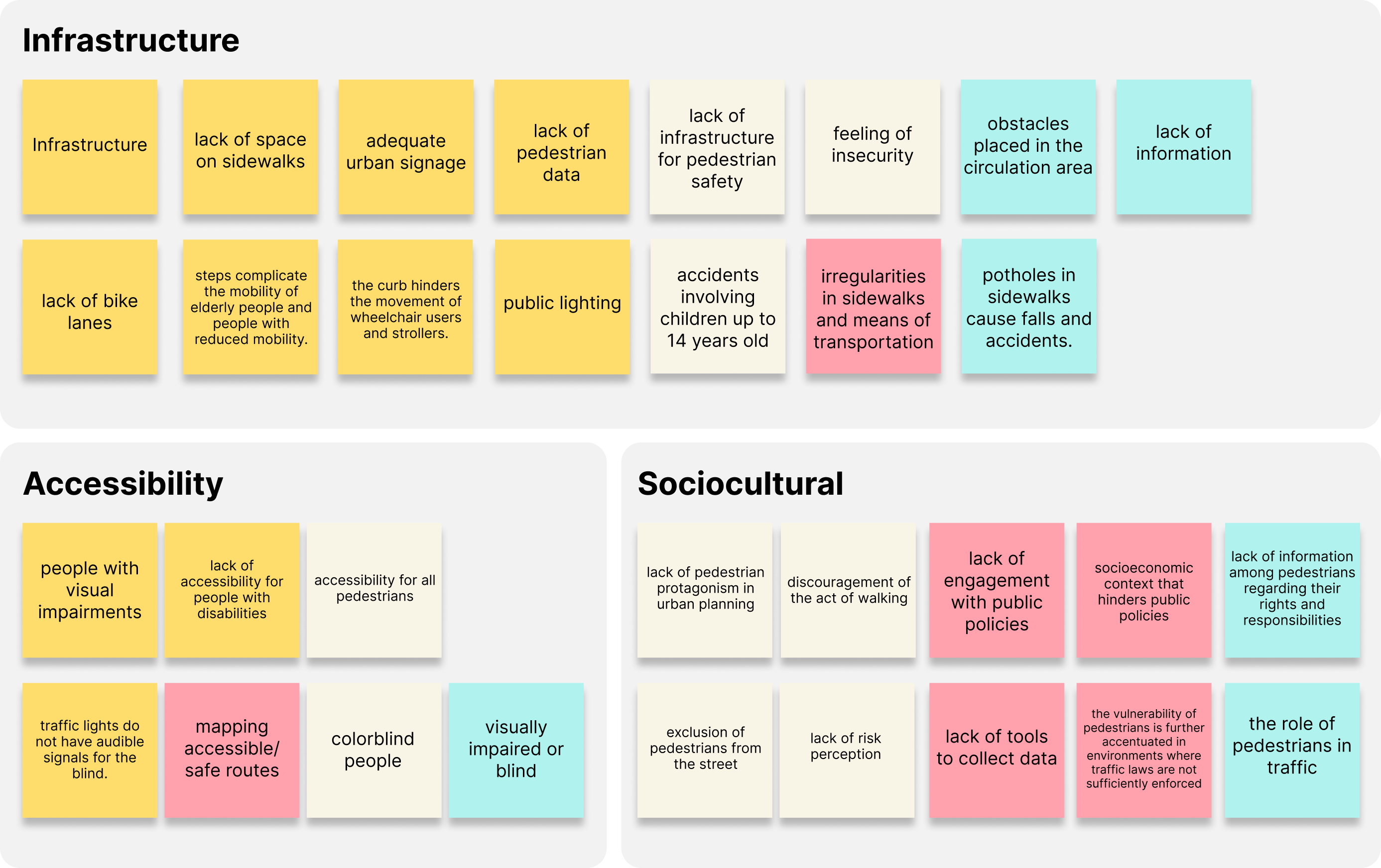
In Brazil, priority in urban interventions are given to automobiles. As a consequence, Brazilian neighborhoods do not have adequate infrastructure for pedestrians, where their basic mobility needs are met:
40% of journeys in Brazil are made on foot or by bicycle
31.000 yearly deaths caused by traffic accidents*
6.000 were pedestrians (equivalent to 20%)*
*(in 2019, according to the Brazilian Ministry of Health)
The Adventure Begins
With only four days to complete the project, I focused on a rapid and pragmatic research approach. I combined quick online desk research with short conversations with pedestrians in Rio to understand their daily pain points and why they rarely engage with official reporting channels.
Desk Research: Reviewed mobility data and the limitations of the existing 1746 complaint system.
User Inputs: Gathered real pain points from short chats with residents about safety, walkability, and bureaucracy.
These were some insights I got with my research:
Engagement Barrier.
Bureaucracy and the lack of feedback discourage citizens from reporting issues and asking for changes.
Priority Blindness.
There is not an open indicator of citizen’s priorities or priority given by the city hall to city improvements.
Lack of Regional Transparency.
There is no visual overview of quantity or category of issues based on region.
With these findings in mind we asked ourselves:
What if citizens didn’t feel alone in their frustrations with their city?
What if we could amplify people's voices by automatically generating official change requests to the government?
With the goal of encouraging the active participation of pedestrians in urban planning to promote the development of a more accessible and humane Rio, we created Papo Reto:
A pedestrian-powered platform that maps the city's problems, as well as positive experiences and suggestions for innovation.
The Route Taken
After defining the concept for Papo Reto, I translated the core UX principles into a visual direction that reinforced our goals: zero bureaucracy, instant contribution, and a friendly, carioca tone.
To guide this transition, I relied on quick sketches and low-fidelity wireframes to clarify navigation flow, hierarchy, and interaction patterns. Each UI choice was directly tied to a user need uncovered during research and to the narrative of our persona’s journey (Dudu).
Below are the key decisions behind the main screens:
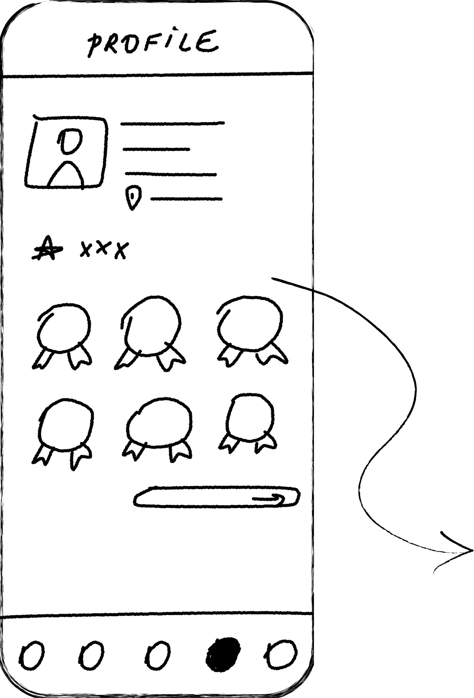
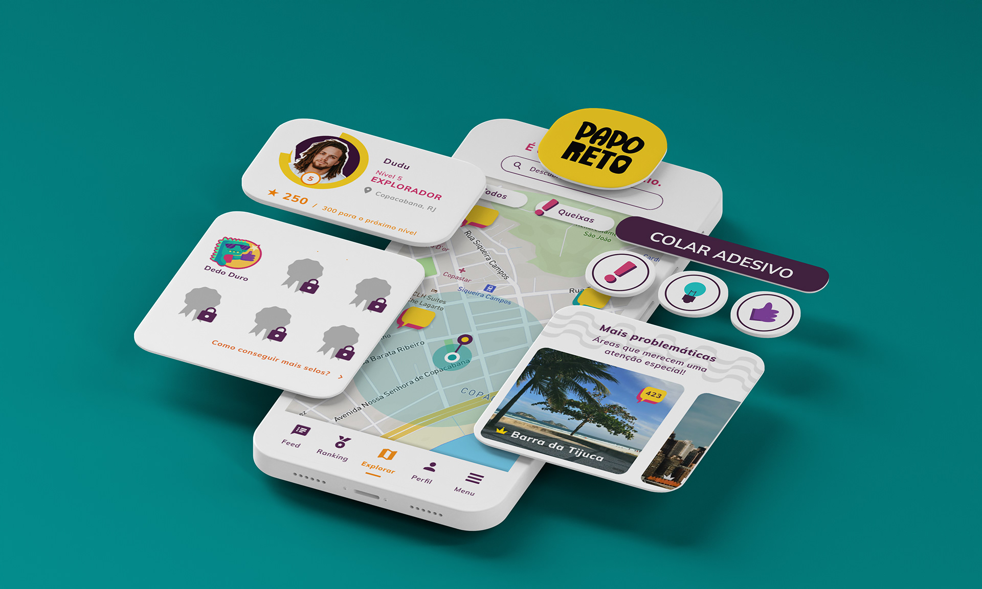
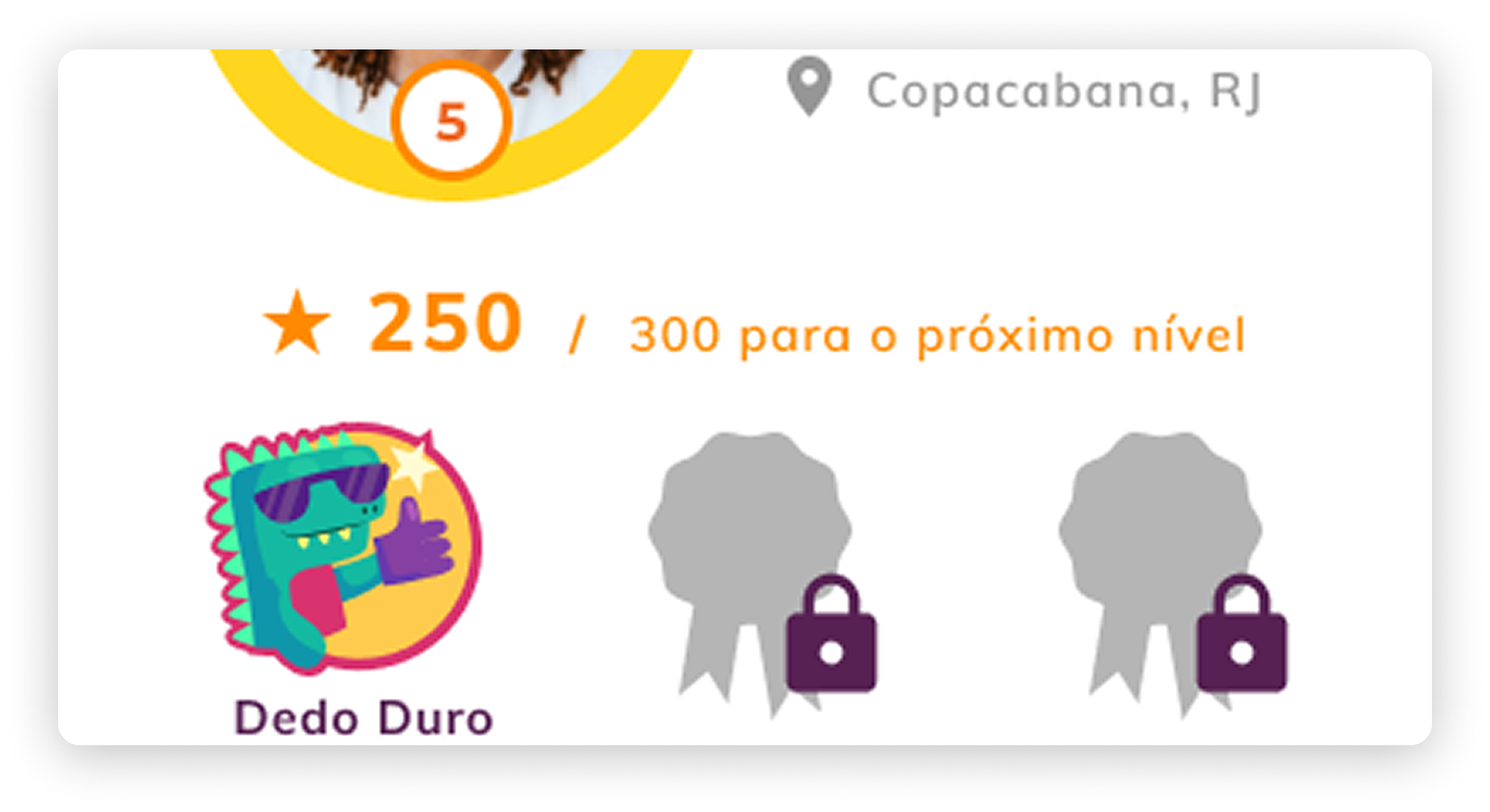
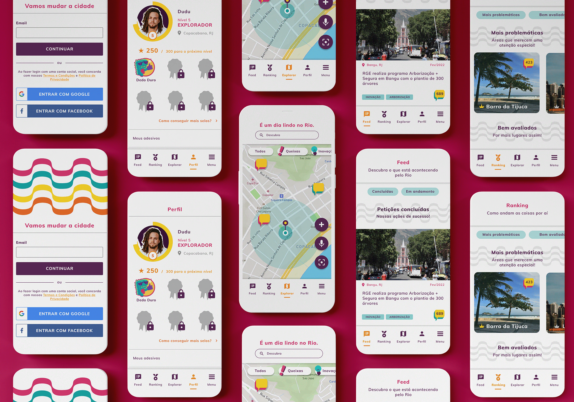
1. Profile
The profile screen needed to celebrate engagement and create motivation for contributing to the city. UI decisions:
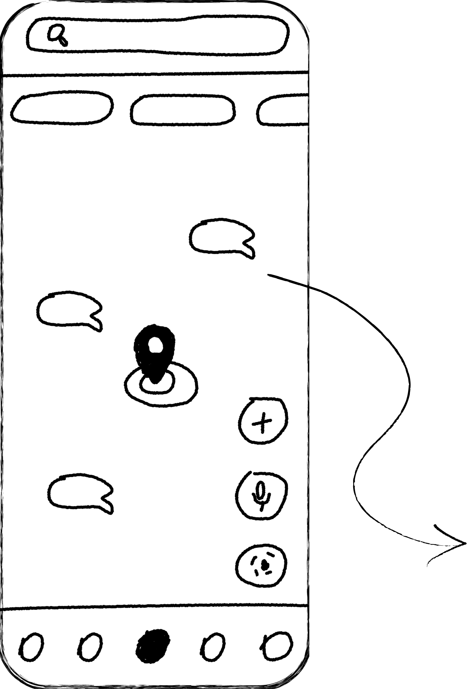
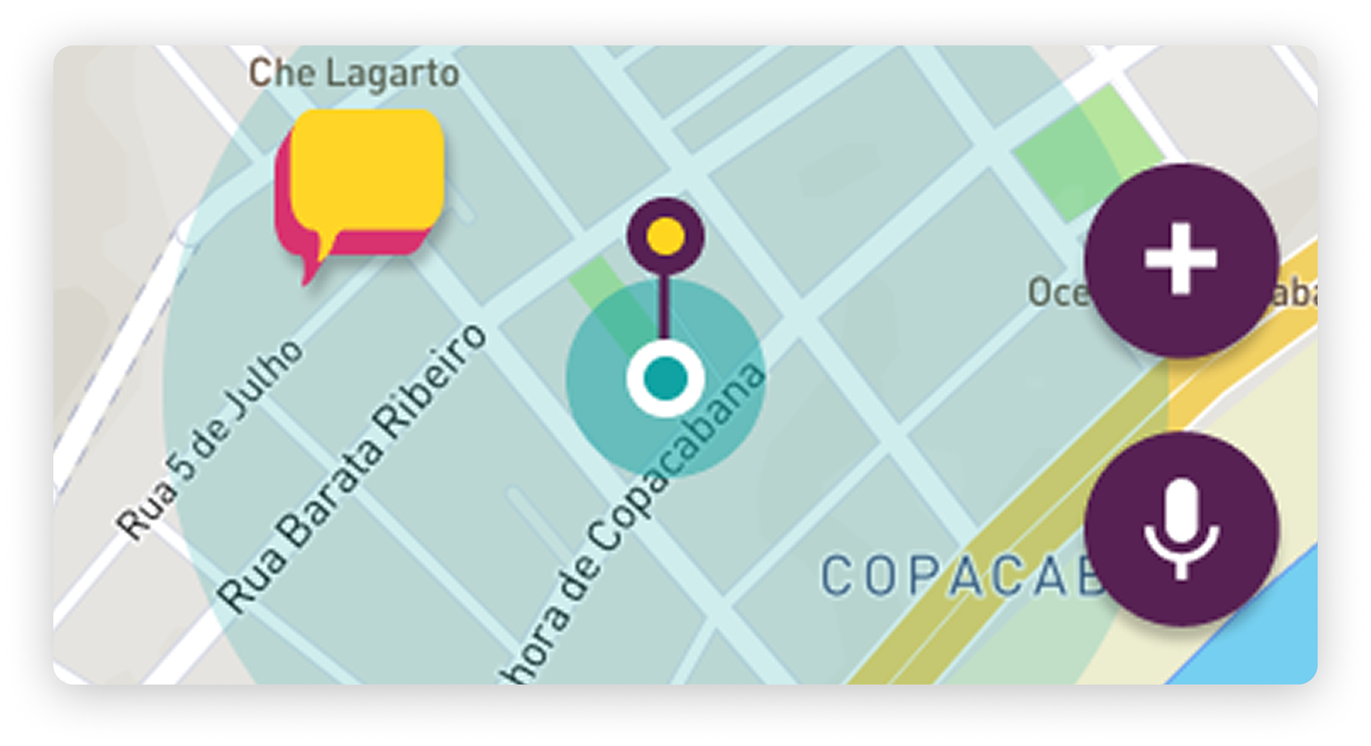
2. Explore
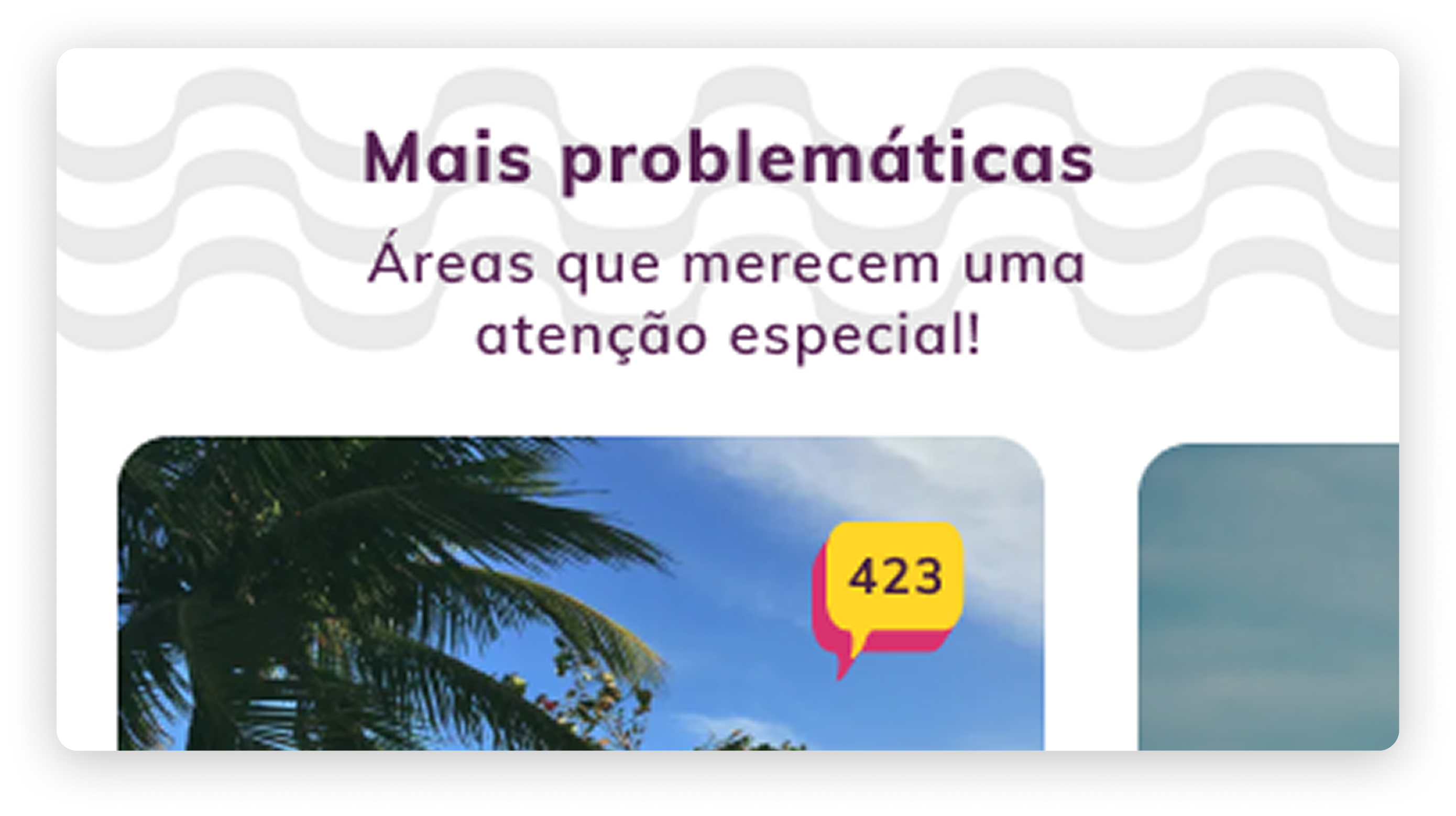
This is the heart of the experience — the place where real issues, compliments, and innovations live. UI decisions:
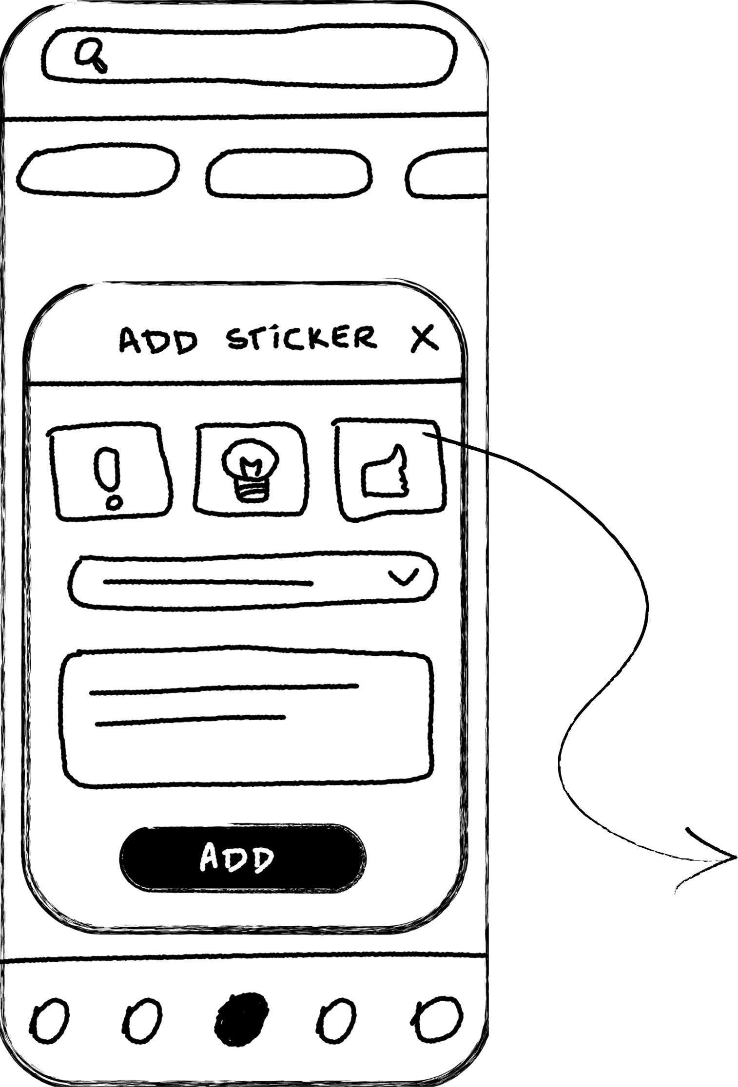
3. Add Sticker
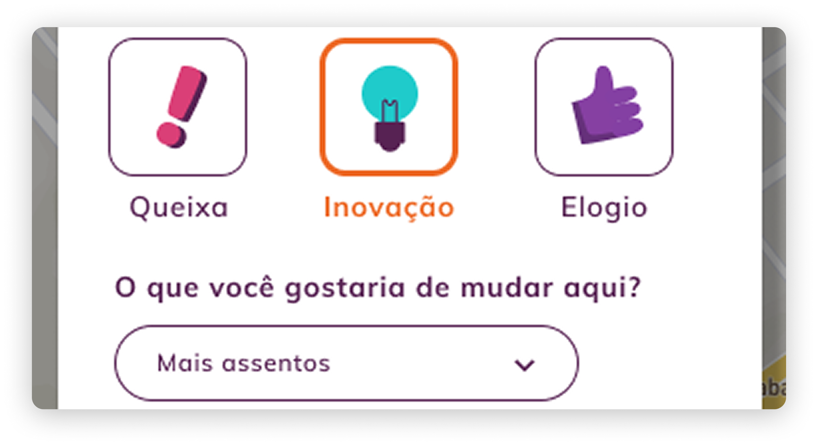
This screen allows users to submit feedback tied to a specific place on the map. UI decisions:
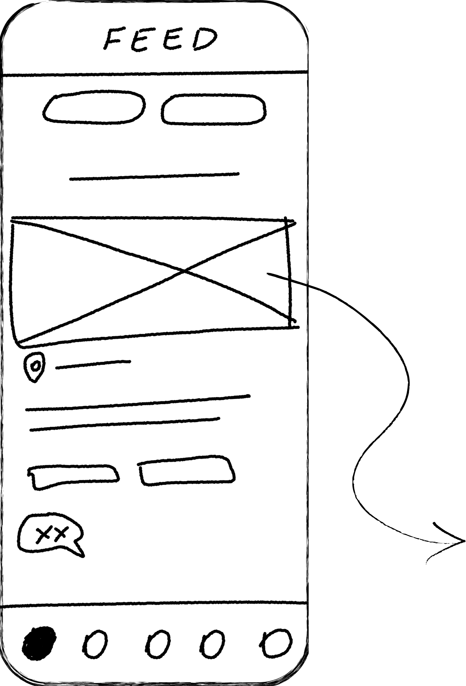
4. Feed
The feed was designed to show the movement of the city — petitions, actions, updates, and community contributions. UI decisions:

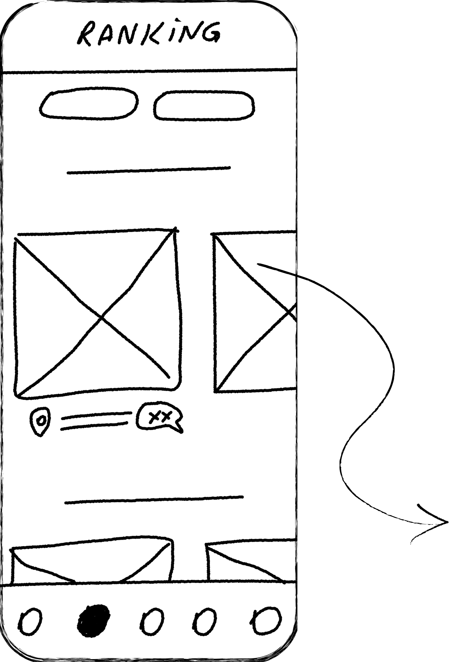
5. Ranking
The Ranking reinforces the playful, competitive layer introduced in the story. UI decisions:
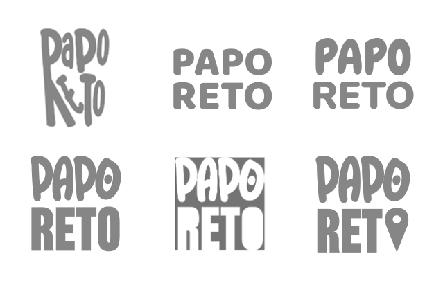
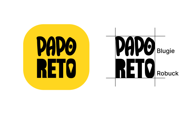
To make the platform inviting and encourage participation, Papo Reto needed a visual identity that felt direct, accessible, and unmistakably carioca.
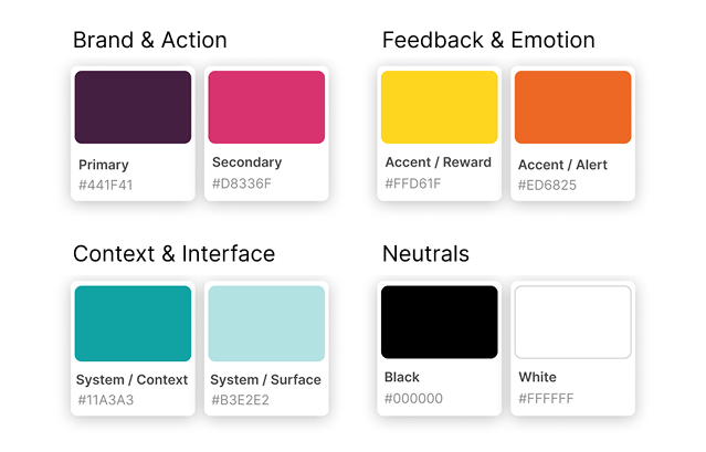
The branding balances a playful tone with civic purpose: bold colors inspired by Rio’s urban landscape, friendly typography, and simple iconography that makes reporting issues feel quick and informal rather than bureaucratic. This identity supports the product’s mission—turning everyday frustrations into collective action—while speaking in a voice that locals immediately recognize as theirs.
“Papo Reto” is a Brazilian slang expression that means speaking in a direct, honest, and straightforward way — without unnecessary detours or bureaucracy. It represents going straight to the point and telling the truth clearly, whether in serious or informal conversations.
To ensure scalability, the platform follows a white-label branding system, allowing each city to adopt its own visual identity while keeping the same core functionality.
Reaching the Summit
After defining the concept, translating UX into UI decisions, and shaping the brand, the final step was bringing everything together into a cohesive experience.
An interactive Figma prototype was created to demonstrate the core flows and interactions of Papo Reto. You can explore and test the experience firsthand through it.
To communicate the concept and impact of Papo Reto, our team presented the project through a short pitch that walks through the problem, the solution, and its potential for citizens, government, and partners. The presentation brings the story to life, demonstrating how the platform empowers pedestrians and transforms individual frustrations into collective action.
The presentation is in Portuguese, but you can turn on English subtitles.
Broader Horizons
Empowers pedestrians by transforming individual frustrations into collective signals that influence city priorities.
Reduces bureaucracy by enabling quick reporting and automatically generating official petitions.
Increases transparency by visualizing urban issues, priorities, and positive experiences across neighborhoods.
Supports city hall decision-making by providing structured, location-based pedestrian data that complements existing channels like 1746.
Encourages sustained engagement through gamification, rewards, and partnerships with local businesses.
Strengthens pressure for urban improvement by exposing issues that directly affect tourism, an essential economic driver for the city.
Promotes inclusion and accessibility through physical totems, allowing participation even without smartphones or internet access.
Scales to other cities through a white-label model that adapts the platform’s identity while preserving its core functionality.
Limited time and validation
The four-day competition format limited the depth of research and user testing, requiring fast decision-making under uncertainty.
How I solved it
I relied on quick desk research, real-life pedestrian experiences, and clear design principles to prioritize the most critical problems and make informed trade-offs within the available time.
Balancing simplicity with systemic impact
The challenge was designing an experience that felt effortless for citizens while still generating meaningful data for public authorities.
How I solved it
I kept user interactions minimal and intuitive, while structuring individual inputs so they could be aggregated into clear, actionable insights for city-level decision-making.
Explore other projects
@3x.png)